In an industry often defined by dense jargon and high-friction interactions, we aimed to create a brand that feels like a quiet partnership.
CLIENT
ICE Insurance
PROJECT
Branding | Web Experience | UI Design
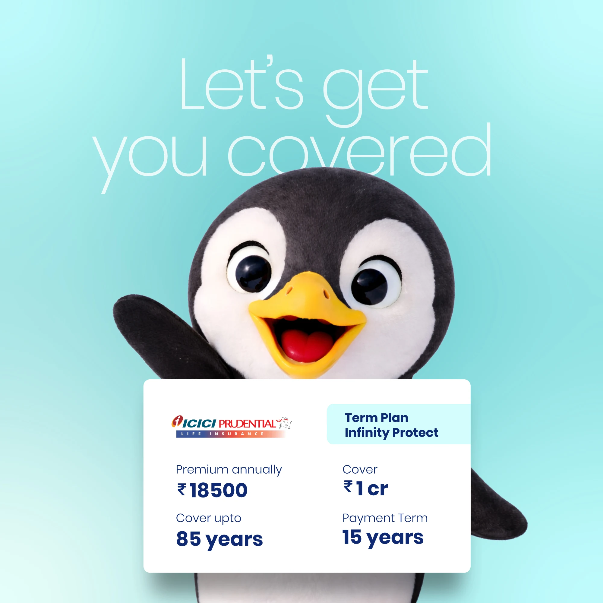
We leaned into a design language inspired by the brand’s name, utilizing a palette of cool blues and crisp whites to create an architecture of composure. This visual serenity acts as a correction to the anxiety typically associated with insurance, establishing a landscape where reliability is felt. To bridge the gap between technical utility and approachable care, we introduced a penguin mascot. The penguin serves as a serene guide across the brand’s ecosystem, humanizing the digital experience and distilling the service into a friendly, modern partnership.
The intervention extended into the technical core of the business, where we designed a dedicated mobile platform for the point-of-sale team. By standardizing the logic across six diverse verticals—including health, motor, and personal accident—we transformed a fragmented data-entry process into a guided, conversion-focused journey. Our focus was on simplifying the data entry, ensuring the team is empowered by a system that values clarity as much as efficiency.
Ultimately, ICE proves that when we lead with legibility and a human pulse, the security of insurance becomes as effortless as it is essential.
An affable brand character brought warmth and ease to the typically rigid world of insurance.
—
A clean, minimal interface ensures every element serves a clear purpose, creating an intuitive and uncluttered path through the app.
Functional cards, clear drop-downs, and subtle micro-interactions guide users through the experience with quiet ease.